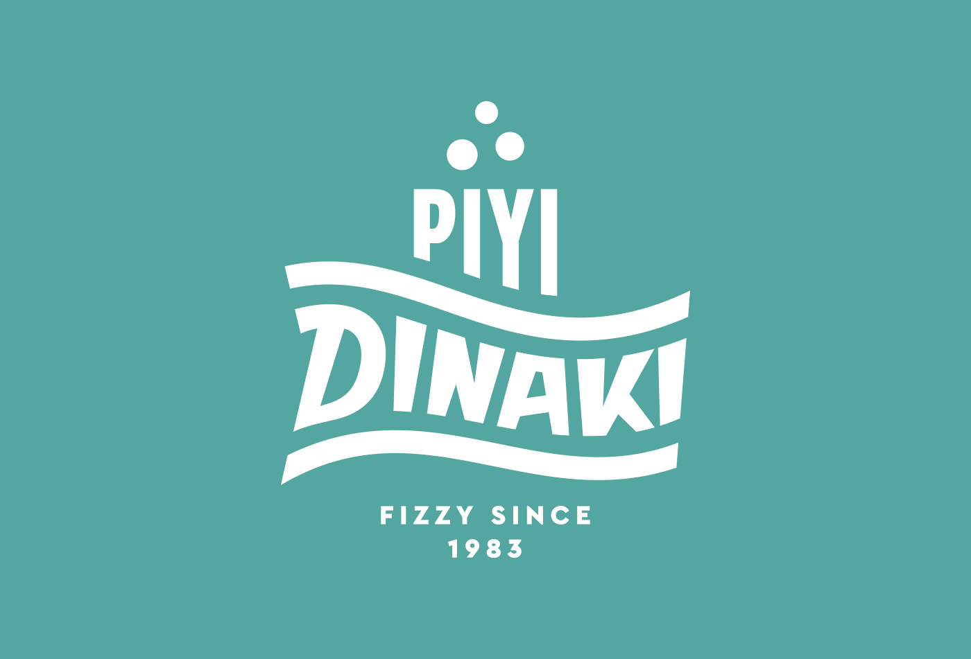
Red Creative in collaboration with Ambigram undertook the project of rebranding the soft drinks company Florinas Dinaki. The brand name was changed to Piyi Dinaki (Piyi means natural spring in Greek). We redesigned the logo, visual identity in its applications to packaging, printed matter, vehicles, refrigerators and clothing.
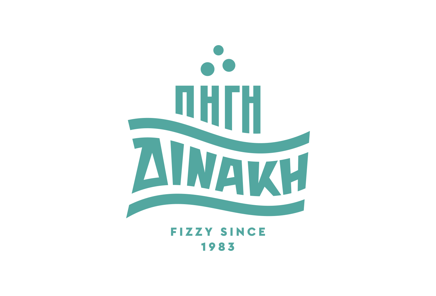
The logo design is based on the idea of the natural spring:
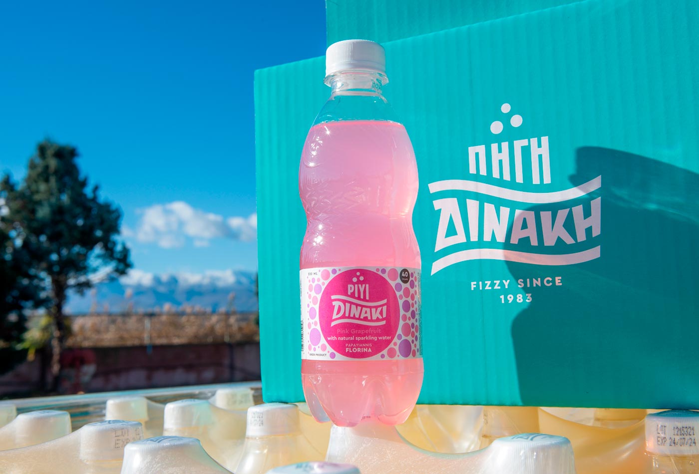
Two wavy lines - that symbolise the horizon of the earth and the horizon of the aquifer - embrace the brand name Dinaki which is hand drawn in a wave form. The word Piyi emerges from the horizon and the three bubbles on top symbolise the natural mineral water.
The overall vintage look reflects the company's 40-year history.
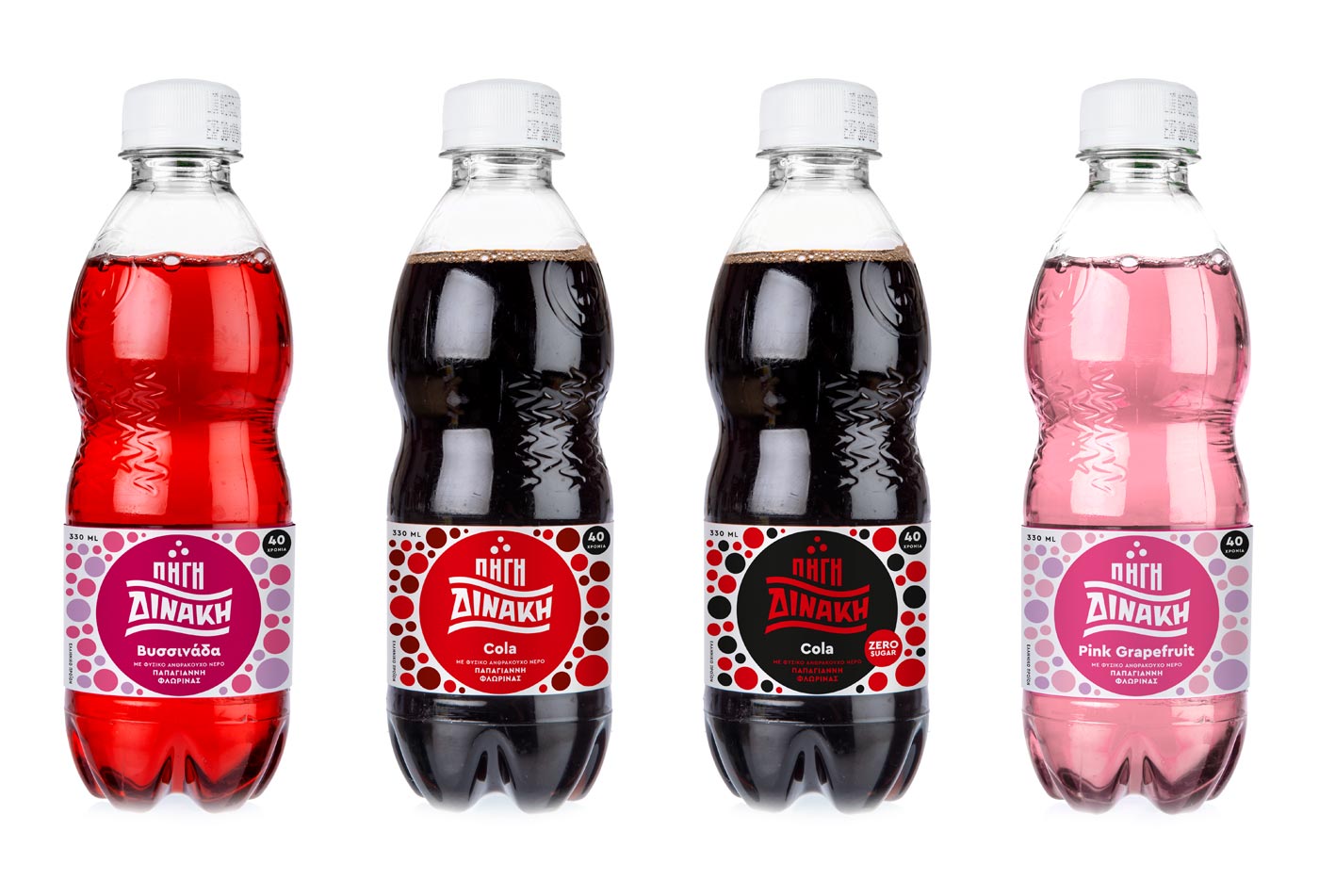
We redesigned the labels of the basic series (8 soft drinks) using the new logo in a circle as the dominant element, surrounded by bubbles in colour harmony with the colour of the circle.

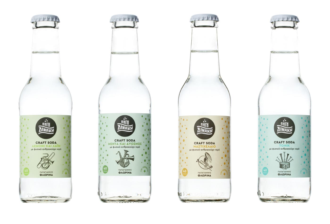
The basic series is complemented by a premium series of Craft Sodas for which we created collages of brass horns - a reference of the long tradition of brass bands in the Florina and western Macedonia area.
Corporate identity and product launching brochure.


Four Table Tents were designed for the Craft Sodas, to be used as promotional items on tables of bars and restaurants.

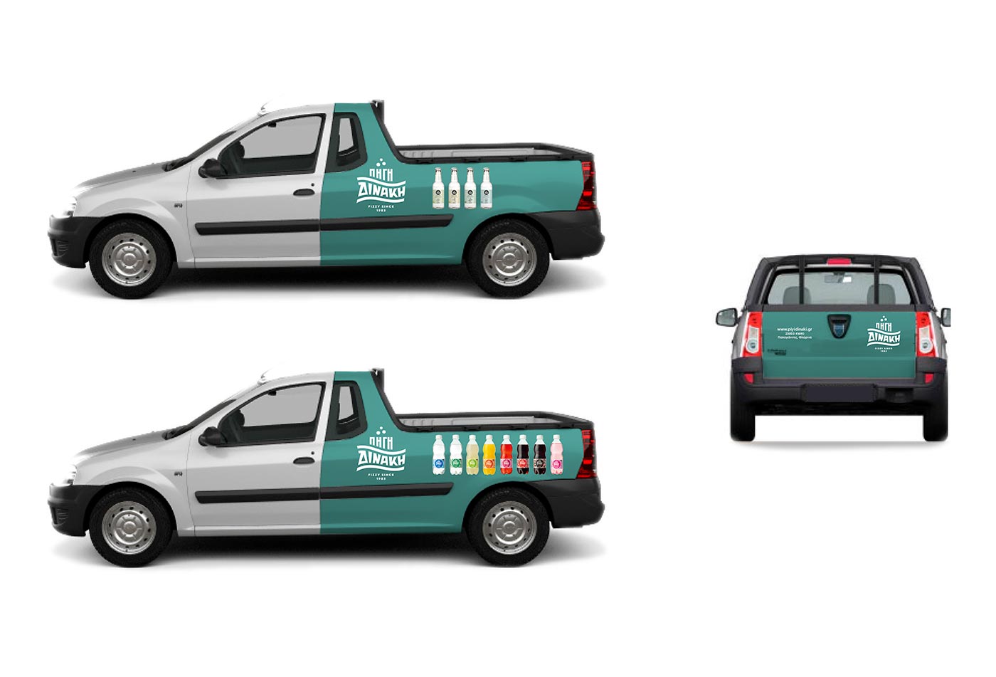
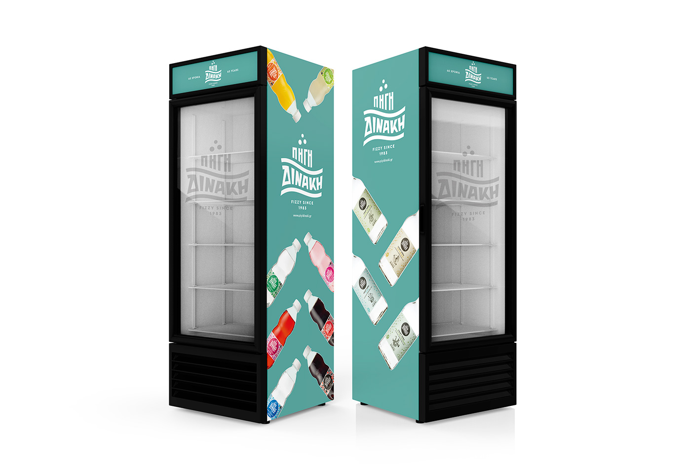
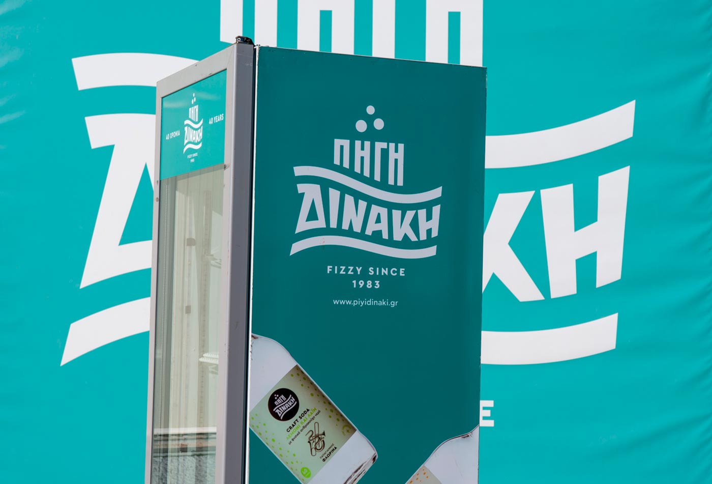
The new visual identity was applied on vehicles, refrigerators and clothing.


Mount Verno or Vitsi along with Mount Voras, feed the natural springs of the Florina area.
